I can’t say for sure that this is a ‘rule’ being taught in photography, but if it isn’t it should be. And I’ll start the lesson now…
What’s the 3 Colour Rule in Photography?
The content of your image should be complemented by the colours used, so pick wisely.
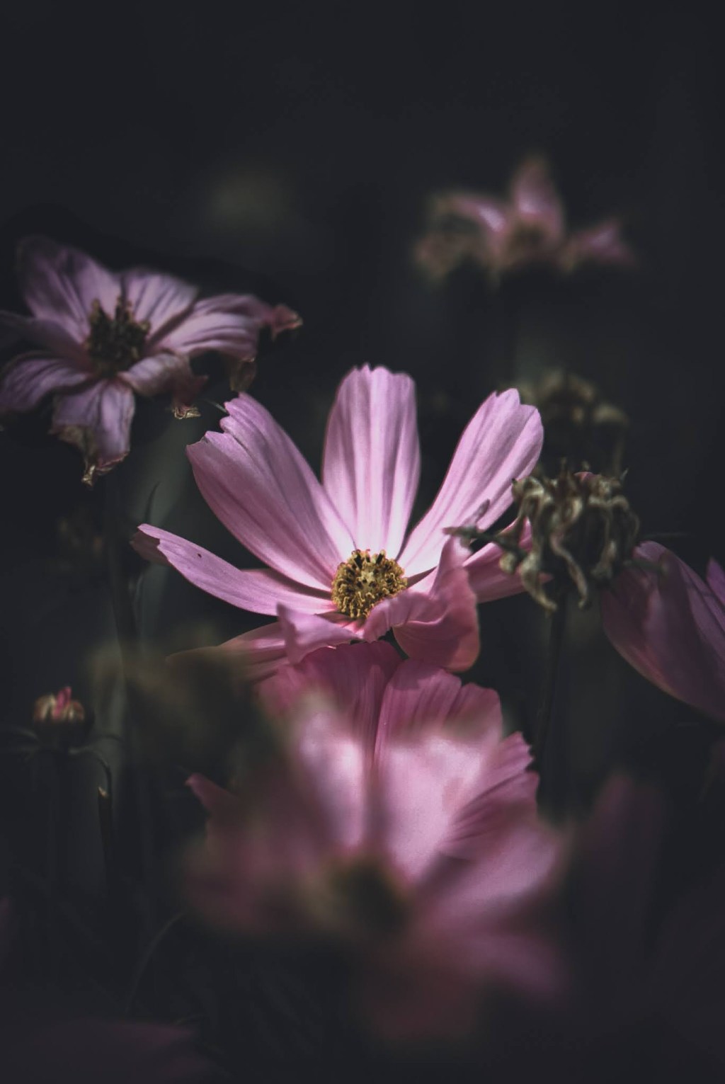
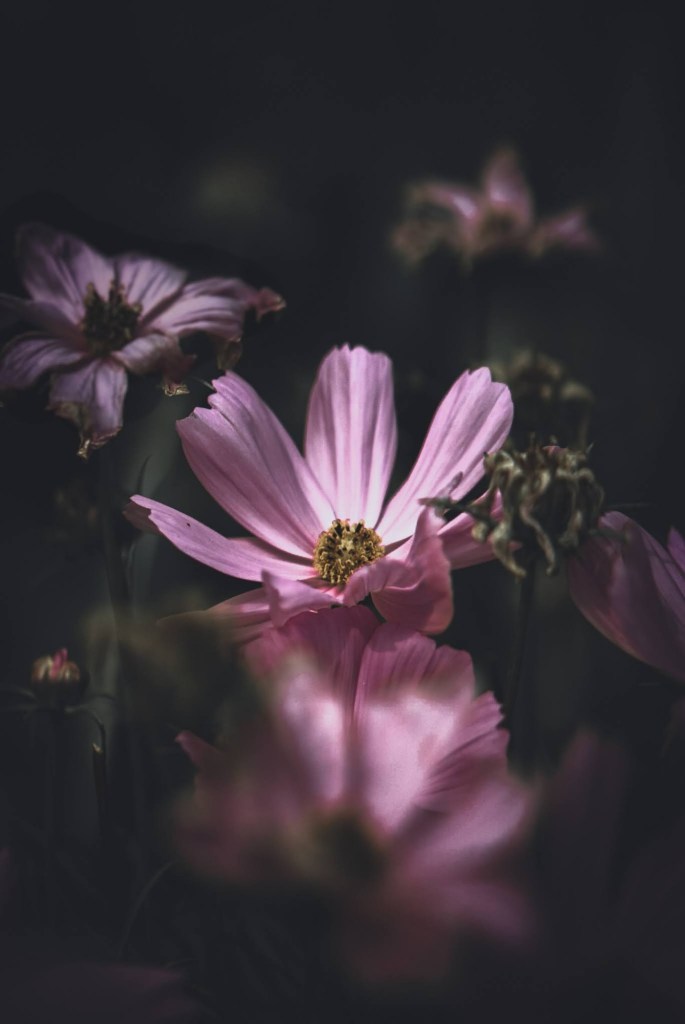
For a well-rounded and tight palette, I would advise sticking to a 3 colour rule – a base, secondary and accent. Let me give you some examples…
1. Choose a Base Colour
This is your overriding colour and the one that first hits the eye. It will be the one that is most abundant in your image. You could also call it the primary colour, but it doesn’t have to be a primary colour (in the sense of a colour wheel). Your base colour should set the tone for the secondary.
Picking the base colour should help inform which secondary colour you use – as they should complement each other and not jar. Here are some examples of complementing colours…
- Black & White
- Green & Red
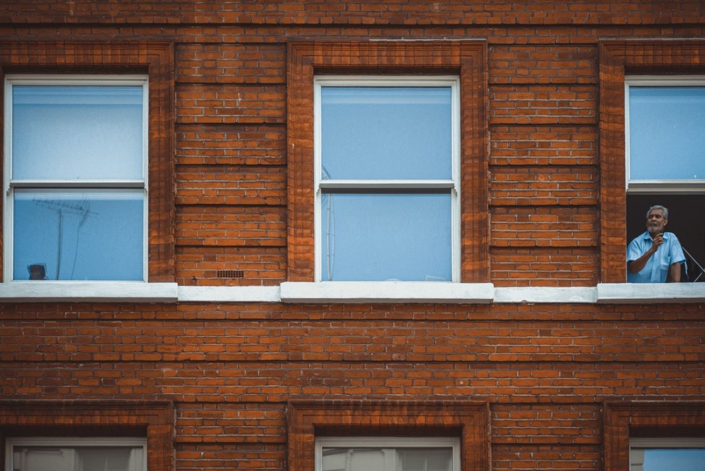
- Blue & Yellow / Orange
- Pink & Green
- Purple & Yellow
2. Pick a Secondary Colour
With your base colour, select your secondary to support. If you prefer monochromatic shots it could be different tints or shades of the base colour (i.e. dark pink and light pink). It doesn’t have to be a complementing colour as mentioned before.
Either way, make sure you don’t choose a colour that clashes with your base as it’ll cause more distraction taking the eye away from the subject.
3. Add an Accent Colour
The accent is the smallest tone featured in the image, but the most eye-catching. It could be a red coat, a blue car etc, either way, it’s the one that will be on (or very close by) to your subject matter.
The accent hue can be different and unrelated to the other two colours if you want drama, or it could be a tertiary colour based on the primary and secondary. Using a colour wheel is really helpful to make these choices.

Final Words
When you don’t follow this 3 colour rule in photography then images can look erratic and unplanned (which is when black and white can cover your sins lol). But ideally, if you can control the scene then think about the colours in your viewfinder.
When you get to editing your photos you can spend time with adjustment brushes and layers to change colours you weren’t able to control on location.
Controlled and tight colour palettes deliver images that look sleek, refined and thoughtful. Bear in mind the next time you’re shooting and let me know if it’s changed your thinking.

Leave a Comment