
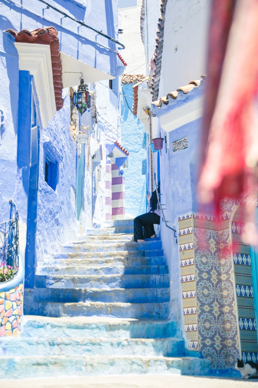
Ever wondered why certain photos evoke different emotions? Colours play a pivotal role in shaping our perception of images.
In this section, we’ll explore the psychology of colours, discussing how they impact our emotions and reactions. From the vibrant reds to the calming blues, each hue carries a unique significance that influences the narrative of a photo.
Unravelling the Most Dangerous Colour
It’s time to unravel the mystery – what is the most dangerous colour to have in a photo? Contrary to expectations, it’s not necessarily black or red. We’ll delve into studies and research that reveal surprising findings about the psychological impact of specific colours, and how they can potentially alter the way we perceive images.
Prepare for a colour revelation that might make you rethink your photo aesthetics.
The Subtle Art of Colour Manipulation
While understanding the impact of colours is crucial, mastering the art of colour manipulation can take your photography to the next level.
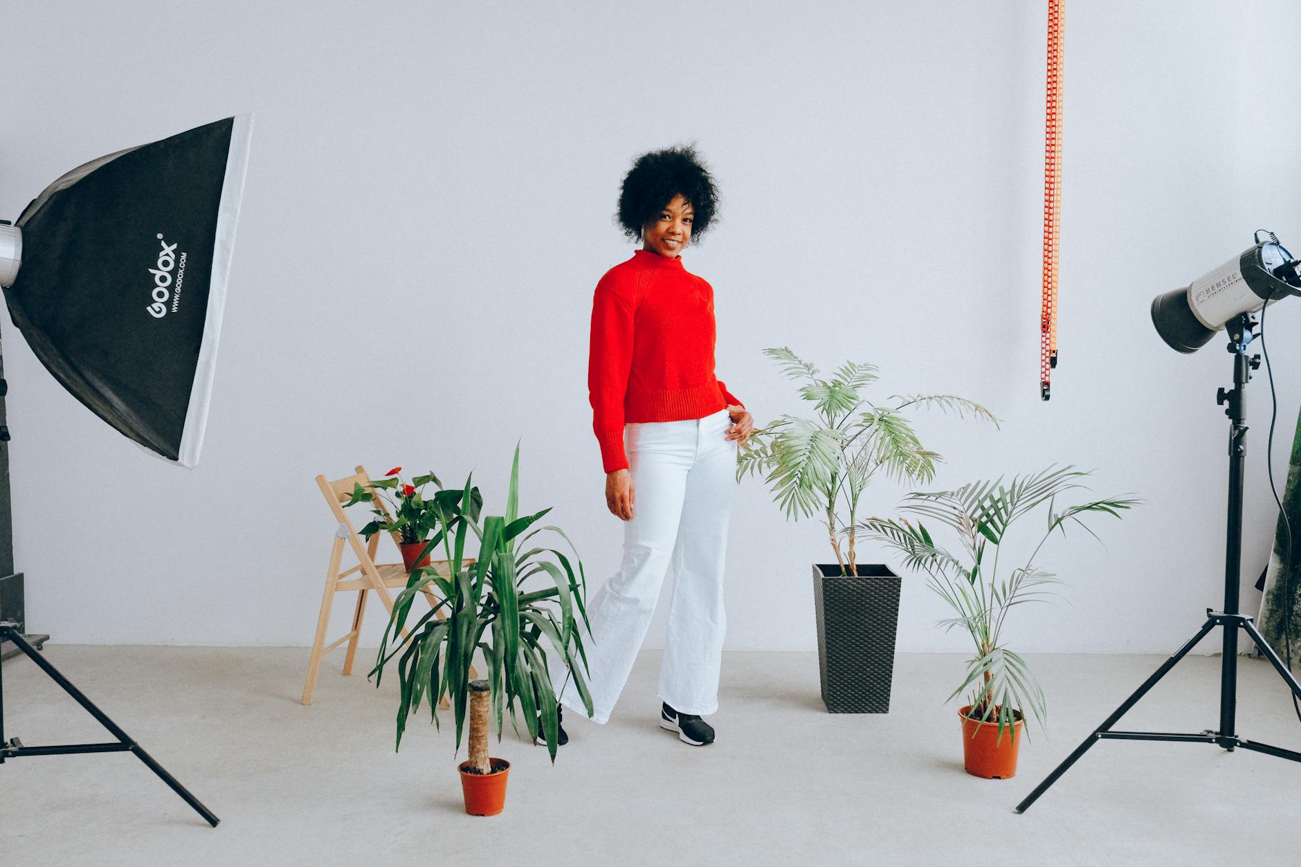
This section will provide practical tips on how to use colours intentionally in your photos, avoiding the pitfalls of the most dangerous colour while creating visually stunning and emotionally resonant images.
Here are 4 practical tips to help you leverage colours effectively in your photography:
1. Understand Colour Theory
Familiarize yourself with the basics of colour theory. Learn about the colour wheel, complementary colours, analogous colors, and how different hues evoke specific emotions. This foundational knowledge will guide your colour choices and help you create harmonious compositions.
2. Consider the Mood and Emotion
Each colour carries a unique emotional connotation. Warm colours like reds and yellows often evoke energy and passion, while cool colours like blues and greens convey calmness and tranquility. Before shooting, think about the mood and emotion you want to evoke in your audience, and choose colours that align with those feelings.
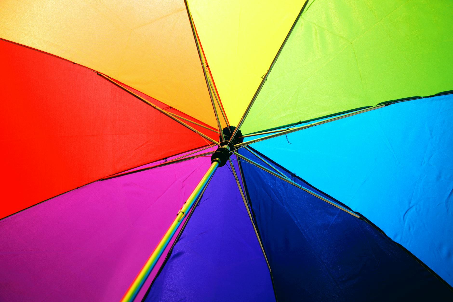
3. Pay Attention to Colour Combinations
Experiment with color combinations to create visually pleasing and balanced images. Complementary colours (opposite on the color wheel) can add vibrancy and contrast, while analogous colours (adjacent on the wheel) create a more harmonious and serene look. Be mindful of the relationships between colors within your frame.
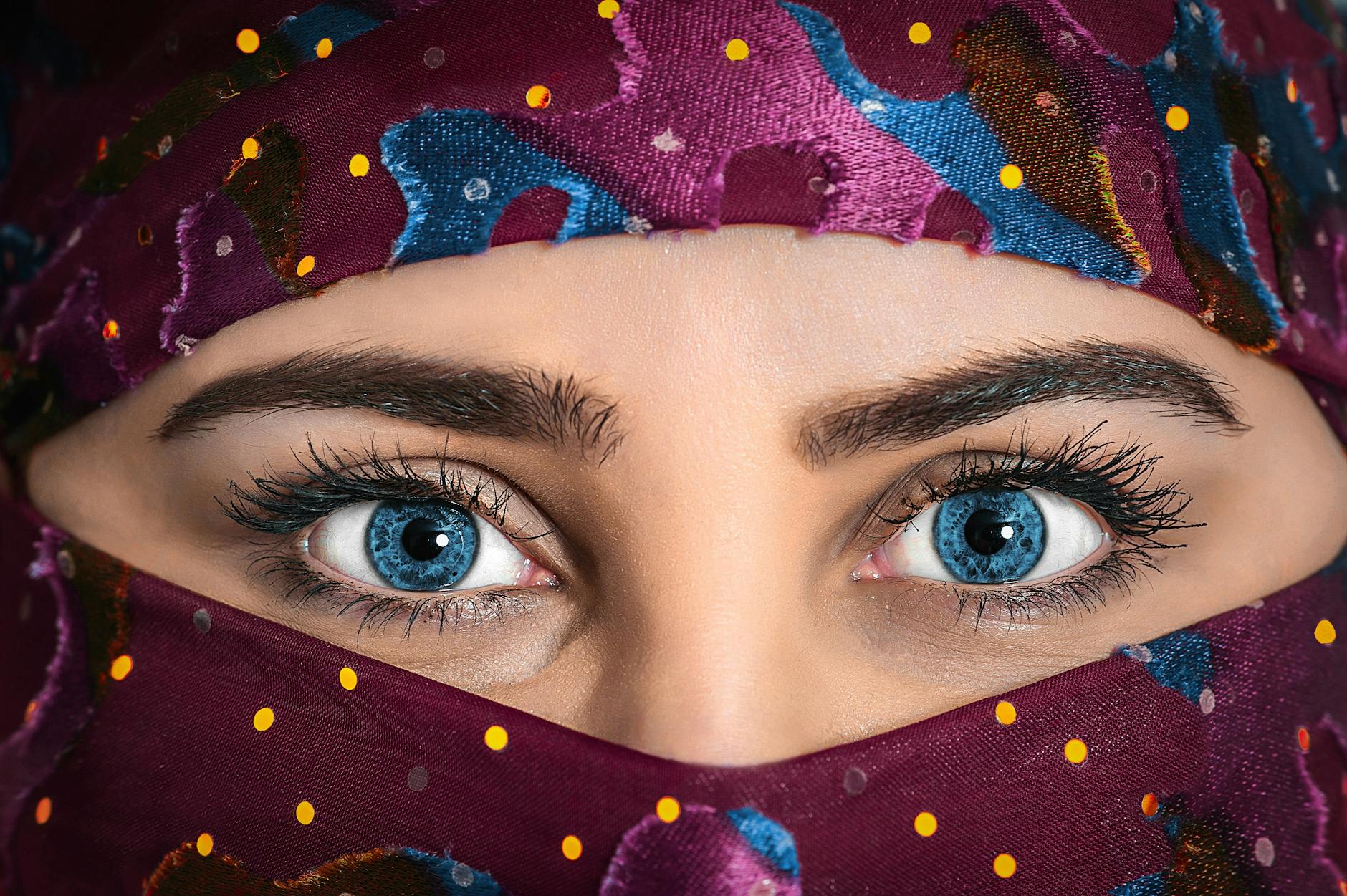
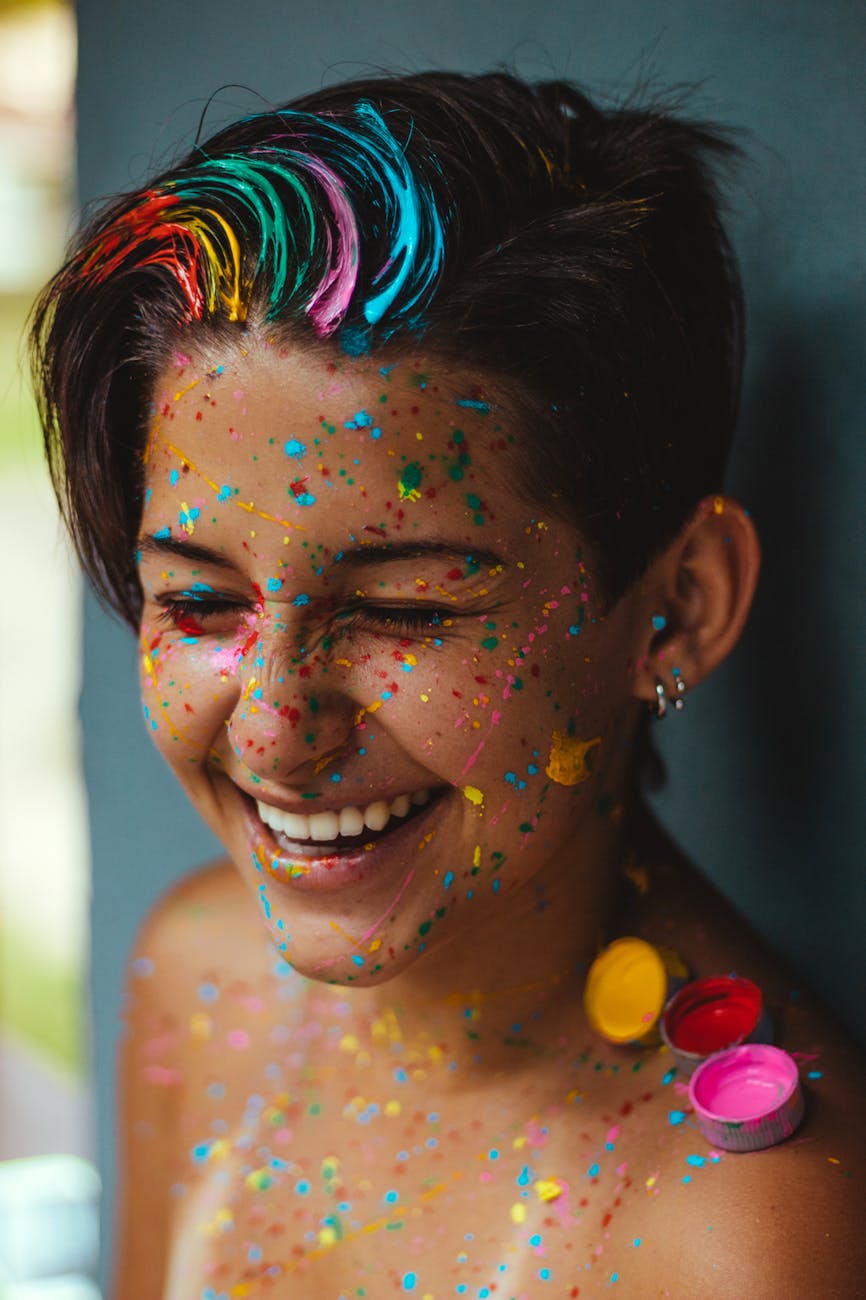
4. Use Colour as a Focal Point
Make a specific colour the focal point of your composition. Whether it’s a single vibrant object in a muted environment or a splash of colour against a neutral backdrop, directing attention to a specific hue can create visual interest and draw viewers into the story you’re telling.

Real-life Examples and Case Studies
To bring the concept home, let’s explore real-life examples and case studies of photographs that either succeeded or failed due to colour choices. By analysing these instances, we can gain valuable insights into the dos and don’ts of colour composition, helping you navigate the intricate world of hues in our photographic endeavors.
When Dangerous Becomes Daring
In photography, rules are meant to be broken. I encourage you to challenge conventional notions about the most dangerous colour. I’ve picked out some instances where photographers embraced the risky hues, turning potential pitfalls into bold statements. Sometimes, the most dangerous colour can be a powerful tool for creative expression.
Steve McCurry’s “Afghan Girl” (1984)
Steve McCurry’s iconic photograph of the Afghan Girl, featured on the cover of National Geographic, is a powerful example. The intense green of the girl’s eyes against the warm, earthy tones of her surroundings creates a mesmerizing and emotionally charged image. The use of a vibrant, unexpected colour for the subject’s eyes enhances the photo’s impact and makes it unforgettable.
Martin Parr’s “The Last Resort” (1986-1987)
Martin Parr, known for his satirical and vibrant documentary style, embraced bold colors in his series “The Last Resort.” Photographing working-class leisure in the UK, Parr used vivid and sometimes garish colours to highlight the unique atmosphere of seaside resorts. The unconventional use of colour contributes to the series’ distinct visual language and social commentary.
Joel Meyerowitz’s “St. Louis Arch” (1978)
Joel Meyerowitz is celebrated for his use of colour in street photography. In his photograph of the St. Louis Arch, the sky is an intense shade of cyan, creating a surreal and otherworldly atmosphere. By deviating from the natural colour of the sky, Meyerowitz turns a conventional architectural shot into a visually compelling and thought-provoking image.
Richard Mosse’s “Infra” Series (2010-2011)
Richard Mosse’s “Infra” series captured conflict zones in the Democratic Republic of Congo using a discontinued military surveillance film that rendered vegetation in a vibrant, shocking pink. The surreal use of colour adds a layer of unreality to the harsh realities of the subject matter, challenging viewers to reconsider their perceptions of war photography.
David LaChapelle’s Surreal Portraits
David LaChapelle, known for his extravagant and surreal portraits, often incorporates bold and unusual colours. His vibrant and hyper-realistic compositions, filled with intense pinks, blues, and greens, create visually arresting images that challenge traditional notions of portraiture. LaChapelle’s work demonstrates how embracing risky hues can contribute to the overall impact and uniqueness of a photograph.
Embracing the Colourful Journey
As we conclude our exploration of the most dangerous colour, it’s essential to remember that photography is a journey of self-discovery and artistic expression. Embrace the colourful spectrum of possibilities, experiment with different hues, and don’t be afraid to push the boundaries.
After all, the most dangerous colour might just be the key to unlocking your photographic creativity.

Leave a Comment