
Colour plays a crucial role in photography. It does more than just make an image visually appealing—it shapes how people perceive and respond to a photo. Understanding the psychology behind colour helps photographers make intentional choices, ensuring that their images convey the right mood, message, and story.
How Colour Influences Emotion
Colours trigger emotions and associations that can vary based on culture, personal experience, and context. However, some general psychological effects apply universally.
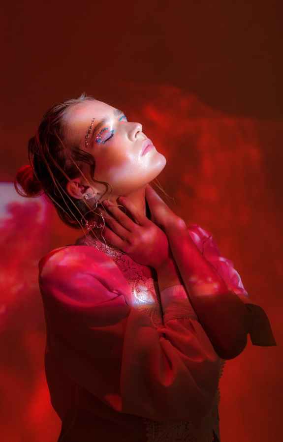
- Warm Colours (Red, Orange, Yellow): These colours are energetic, attention-grabbing, and evoke feelings of warmth, passion, or urgency. Red can signal love or danger, orange is often associated with enthusiasm, and yellow conveys happiness or caution.
- Cool Colours (Blue, Green, Purple): These tones are calming, often linked to nature, tranquillity, and trust. Blue is frequently used to communicate stability, green symbolises growth or renewal, and purple conveys creativity or mystery.
- Neutral Colours (Black, White, Grey, Brown): Neutrals act as a grounding force in an image. Black can be powerful or sombre, white represents purity and minimalism, and grey often evokes balance or melancholy.

Using Colour to Strengthen Your Composition
A strong understanding of colour theory enhances your ability to guide the viewer’s eye and create mood within an image. Here’s how:
1. Apply the Colour Wheel for Harmony
The colour wheel is a useful tool when selecting colours for composition. Some effective combinations include:
- Complementary Colours: Colours opposite each other on the wheel (e.g., blue and orange, red and green) create strong contrast and visual impact.
- Analogous Colours: Colours next to each other on the wheel (e.g., blue, teal, and green) create a harmonious, cohesive look.
- Monochromatic Schemes: Using varying shades of a single colour provides a subtle yet powerful aesthetic.
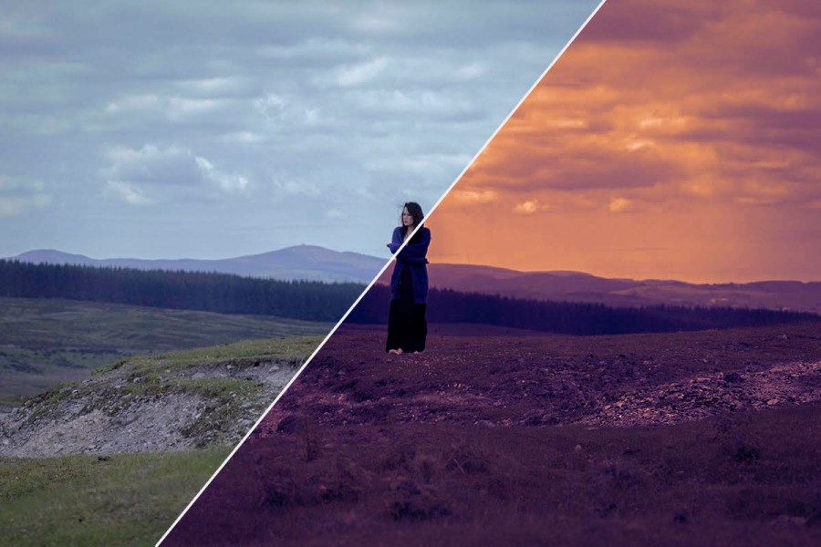
2. Adjust White Balance for Colour Accuracy
White balance settings impact the overall colour tone of an image. Adjusting it manually allows for more control over warmth and coolness in a scene.
If you want to reinforce a mood, slight shifts in white balance can emphasise emotional impact—warmer tones for a cosy, inviting feel and cooler tones for a more detached or sombre effect.

3. Use Colour to Direct Attention
Colour contrast helps guide the viewer’s eye. A bright subject against a muted background, or a splash of red in an otherwise monochrome scene, instantly draws attention. Consider using selective colour grading in post-processing to enhance this effect.
4. Understand the Psychological Impact of Different Hues
Choosing the right colours strengthens storytelling. Here are some examples:
- Red: Used sparingly, red conveys power and urgency. In portraits, it can suggest passion or confidence.
- Blue: Often found in landscape and street photography, blue brings a sense of calm and introspection.
- Green: A popular choice in nature photography, green signifies renewal and harmony.
- Black & White: Stripping away colour forces the viewer to focus on texture, light, and form, adding a timeless or dramatic quality.
How to Practise Colour Awareness in Photography
Step 1: Observe Colour in Everyday Life
Pay attention to how colours interact in the world around you. Notice how lighting affects colour perception and how different tones make you feel.
Step 2: Experiment with Colour Palettes
Try shooting with intentional colour schemes in mind. Pick a dominant colour and build a composition around it. Experiment with complementary and analogous colours to see how they alter the mood of your images.
Step 3: Edit with Colour Theory in Mind
Post-processing allows for fine-tuning colour to reinforce emotion. Tools like colour grading, hue adjustments, and split toning can enhance or shift a mood. Avoid over-editing—subtle changes are often more effective.
Step 4: Compare and Analyse Your Work
Look at your past photographs and assess how colour impacts their emotional response. Identify patterns in your choices and consider whether you are using colour intentionally or instinctively.
Final Thoughts
Colour is a powerful storytelling tool in photography. Whether you’re capturing a vibrant street scene or a moody portrait, the colours you choose influence how your image is perceived. By understanding the psychology of colour, you can make more deliberate choices and create photographs that truly connect with viewers.

Leave a Comment