I’m a firm believer that your photographs always say something about you as a photographer. It’s impossible to take a picture and not leave something of yourself in it. Just like a painting.
A clear photographic style is etched by personality, mood, outlook and understanding of the world surrounding the author. It may be bright and colourful or dark and moody.
Either way I thought I’d cast a self-assessment on my own photography to see how it interprets my personality. It’s a fun, yet revealing exercise to do on your own work to see if how much of your soul goes into your shots.

Choose a Good Subject
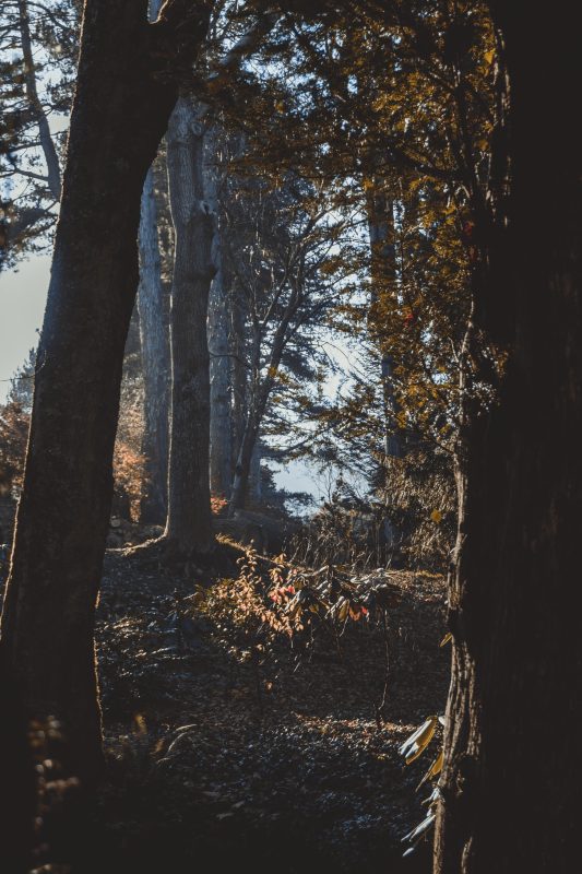
I’m most fond of landscapes, woodlands and portaits – combining them, even better. I find landscapes/woodlands a calming experience and a surprising one – I never know what I’m going to find and I like that it tests my creativity and vision to spot the opportunities.
Portraits are different as I know who I’m working with and what they’re wearing it. It’s that story-telling ability I get to contol which I love in portraits. I can create something that doesn’t already exist through posing and expression.
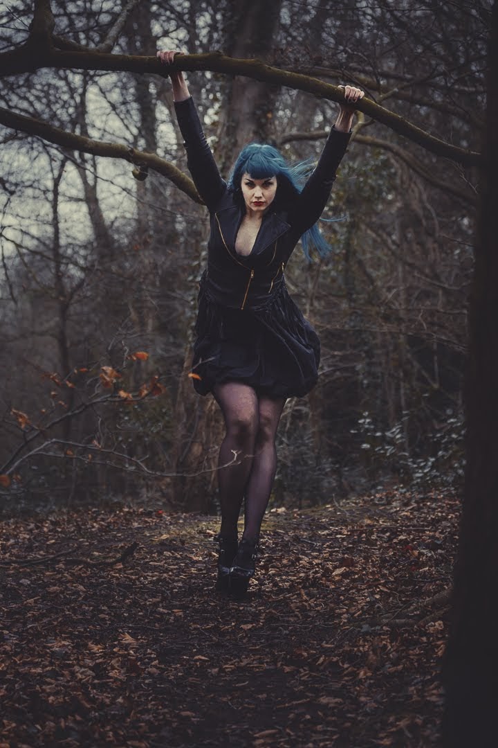

I guess this suggests that I like finding small surprises, little joys that no one has stumbled on before. Given that the world is so well explored it’s humbling to find something unique. And the fact I have that urge to create, as all photographers do, explains that passion of storytelling.
Learn to Use Lighting
How you use light in your photographs again says an awful lot about you. When you’ve developed a style it’s easier to see how you choose to illuminate a subject. As you’ll know I really like things low-key. The darker the better, but with a pool of light sufficient enough to expose the subject.
Having things really dark, doesn’t suggest I’m a dark and grumpy person (I hope not anyway). I know I’m very pragmatic and prefer order over chaos when it comes to design which is why my use of lighting is precise. I only tend to use single sources and rarely touch flashes. A single source points to a single subject – offering a simple, controlled and uniform image.
My heavy vignettes are designed to point an audience to the main subject quicker, again reinforcing that idea that I love order.
Think About Colour
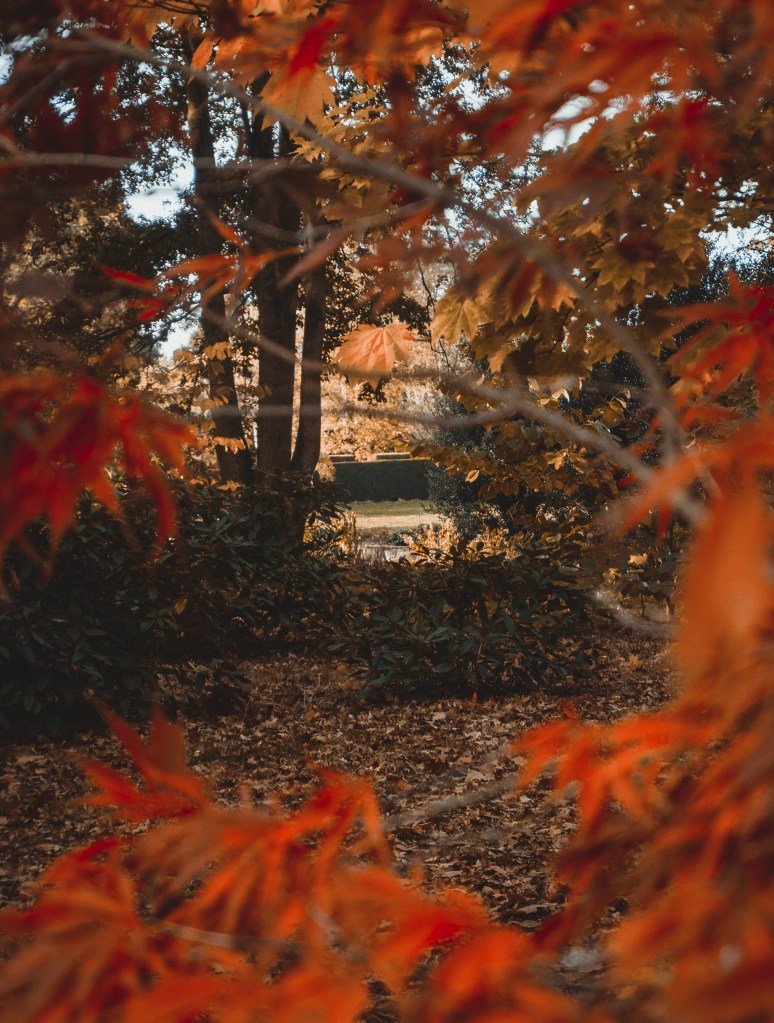
Colours should be chosen so carefully in photography when you’re more experienced. Colour psychology is something all photographers, I believe, should be aware of. My edits tend to subdue blues and greens and lean more to reds, oranges and blacks.
Red is an alarming colour, but also inviting when used in the right shade. Orange is refreshing and exciting and black acts as the base colour (though it’s technically not a colour).
I don’t like white; I find it too revealing and loose in composition. The mind tends to ignore black and focus on actual colours, which helps within a composition, but white registers more in the mind and feels part of the image. So if you can’t crop it out, black it out!
I’ve always loved orange, darker oranges more specifically. It’s a tone that isn’t very popular in art, photography or design and that’s why. I love an underdog – I always opted for the non-popular things at school and college. I guess that’s the creative in me, wanting to break off from the mainstream and find a path of my own.
Without being too grand with this self-assessment I’m hoping this may help someone else review their own style and figure out if their own photography is really reflecting themselves.
Do you do any sorts of artistic reviews like this on yourself? If so, let me know.

Leave a Comment